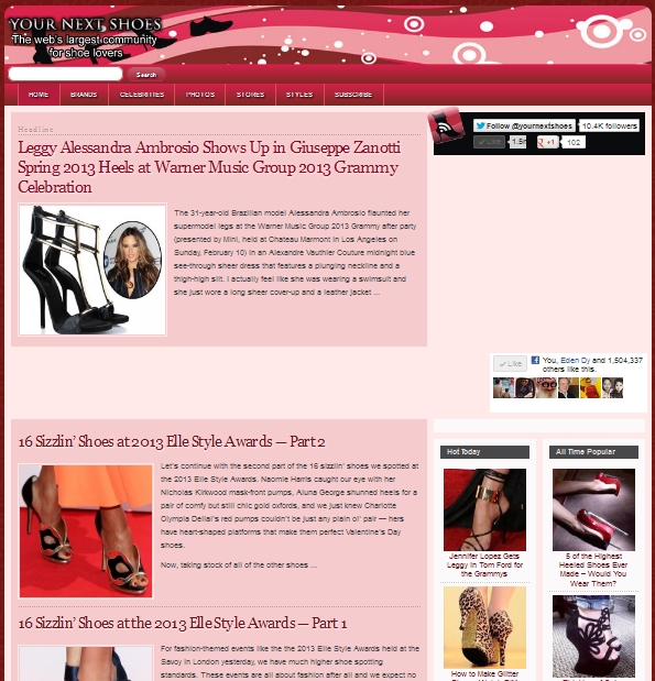
We’re in the process of updating the design of Your Next Shoes. Being a fashion blog, we feel that our previous design was too text heavy, especially in this day and age with picture blogs like Pinterest and Tumblr being so popular. Our new design looked like this (for some reason the ads are not showing):

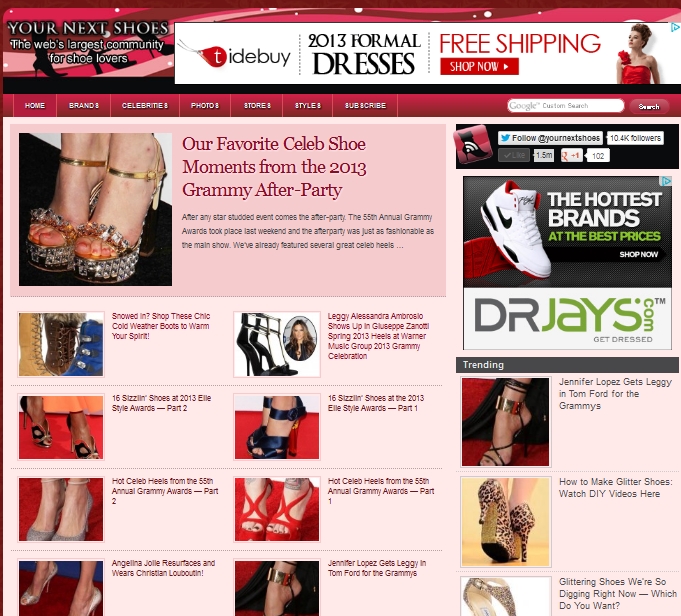
The new design looks like this:

As you can see, it has more pictures and less text. It’ll be interesting to see how our readers like the new design. One way to tell is to see if we get more pageviews and if visitors will spend more time browsing our site than before.